What Makes a Great Dental Office Website?
What is a great dental office website composed of? In this article, we get into it!

I’ve been in the dental industry for a few years now, and have seen my fair share of dental office websites. There have been some really great ones, and some not so great. What I wanted to go into in this blog is: what makes that difference between not so great, and great for a dental office website?
Well, I guess the obvious answer would be: Whether or not it is driving site visitors (potential new patients) to contact the office, make an appointment, and receive services at the office. Now, there are a few elements that would contribute to this outcome, and I want to break these down, point by point on what I’ve seen be successful with the clients that we’ve had the opportunity to work with.
Ease of Use:
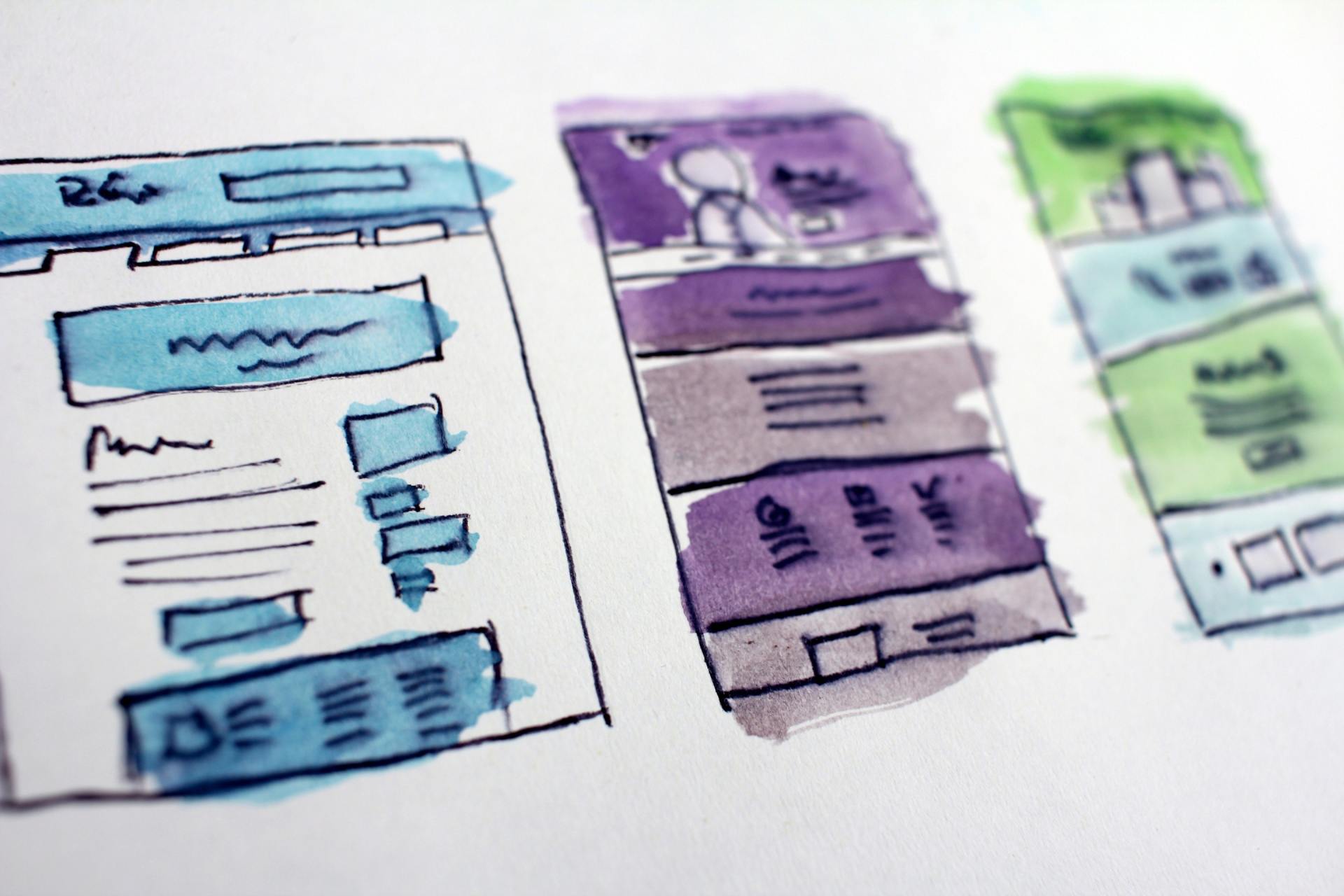
This, on its face, is a bit vague, so allow me to explain: When a potential new patient lands on your homepage (or another page) it should be very clean, non-condensed and easy to see where to go for what that user is looking for. It should be able to be viewed easily on any electronic device someone is trying to view the website on; tablet, cellphone, and desktop. This is mainly just a point in design and user experience. Some websites I’ve seen in the past have actually had some elements on their homepage overlapping, making things confusing and hard to read. There were some instances where the navigation menu of the site was missing, and you’d have to find the exact thing you were looking for in the text of the page itself. A more frequent issue is not having the addresses and phone numbers on your website “clickable” or able to be clicked on, bringing the potential new patient to the point of getting directions or calling the office with just a click of the mouse. Ease of use. In an easy to use website, it’s easy to see what you are looking for right away;
- the navigation is easy to see,
- the page is broken up into logical sections that link to appropriate parts of your website,
- the text is clear and easy to read,
- the website looks great and is optimized on the different screens people will be viewing the site on,
- and contact and direction elements are clickable.

Good Direction:
Now this is touched on lightly with the above point, but it deserves its own section here. Having good direction can easily be the difference between site visitors finding the areas of the site you want them to find, contacting you and scheduling an appointment, leaving the site after not being able to find what they’re looking for. The term “call to action” is used a lot when talking about good direction on a website. A call to action is simply a direction of what to do or where to go next. “Call now to take advantage of our special!”, “Click here to schedule your first appointment!”, “Have a dental emergency? Contact us now to be seen as soon as possible!”, etc., are all good examples of calls to action. Good direction on the website also involves placing, in the copy itself, links to parts of your website that correspond to what is written.
Here’s an example: On your homepage it is written “We offer the full array of dental services at our office - from simple dental cleanings, to full mouth restorations. We do it all!” The words “dental cleanings” and “full mouth restorations” would then link to individual service pages respectively. Then on those service pages you could have a call to action towards the bottom that reads “Schedule your first dental cleaning with us today!” (or something effective for the full mouth restoration page) and a short contact form that will be sent to your email. Overall, direction is important on your website. It helps to guide the visitor into the areas of the site you want them to go to, and also guides them to contact your office. Without calls to action and direction, site visitors will often opt to go to another dentist’s website and schedule with them.
“The fact that the people who built the site didn’t care enough to make things obvious - and easy - can erode our confidence in the site and the organization behind it.”
- Steve Krug, Don't Make Me Think, Revisited: A Common Sense Approach to Web Usability
Marketing Elements:
“Marketing elements” for your website simply means aspects of a website that direct a visitor towards products and services, that prompt action using buttons or calls to action, that show that you're skilled and an authority in your field, and that generally show that you encourage visitors to contact the office for products and services that you offer. The opposite of a “marketing website” would be an “information website”. The difference being, with an information website, there is no clear calls to action or directions towards services or products - like some governmental websites. A good marketing website would be amazon.com. When you visit it you see clear offers, direction, calls to action etc. They want you to do things on your site, contact them, make a purchase etc. How this translates into a dental site would be having, on your dental office site those similar qualities: calls to action, direction towards your products and services, clear reviews and testimonials, before and after images, buttons that prompt action, special offers, and other things similar.
“Pages with a clear visual hierarchy have three traits: The more important something is, the more prominent it is. The most important elements are either larger, bolder, in a distinctive color, set off by more white space, or nearer the top of the page - or some combination of the above.”
- Steve Krug, Don't Make Me Think, Revisited: A Common Sense Approach to Web Usability

SEO Elements:
I’m sure a number of you reading this have heard the term “ SEO
” before and, some of you may even know what it means, and some of you readers will even know a bit about it - but let me define it again here anyway: SEO is an acronym for Search Engine Optimization. It’s basically the field of websites and online marketing that covers the optimization of your website, and general online presence, so that more and more people find your website, and contact you thereafter, for service. SEO Elements for a dental office’s website would include things such as: using appropriate keywords pertaining to your area (city and state), and the services that you offer, tagging images with appropriate keywords, ensuring that the title of a page is appropriate to the content of the page, adding a description for search engines, etc. There’s a lot that goes into having a website properly set up so that search engines can find them easier, and it would be a fairly extensive, and quite frankly, technical list. I’ll get into SEO in another blog later on to go more in-depth.
So, the above are some key points that make a great dental office website. We’ve recently started offering free website analyses where I personally review your website and see how much of these qualities exist, and what I’d recommend adding to it, or fixing. Feel free to reach out to me via email at webservices@xpresspromotion.com, or give me a call at 877-604-7112. During this analysis you are free to ask any questions that you have - I’ll answer to my best ability! Thanks for reading!
Refs:
- Don’t Make Me think, Revisited: A Common Sense Approach to Web Usability (3rd Edition) - Steve Krug
- The Design of Everyday Things - Donald A. Norman
- Marketing in the Age of Google - Vanessa Fox
- The Art of SEO: Mastering Search Engine Optimization - Eric Enge, Stephan Spencer, and Jessie C. Stricchiola